Search Results Page Redesign
Uline
2021
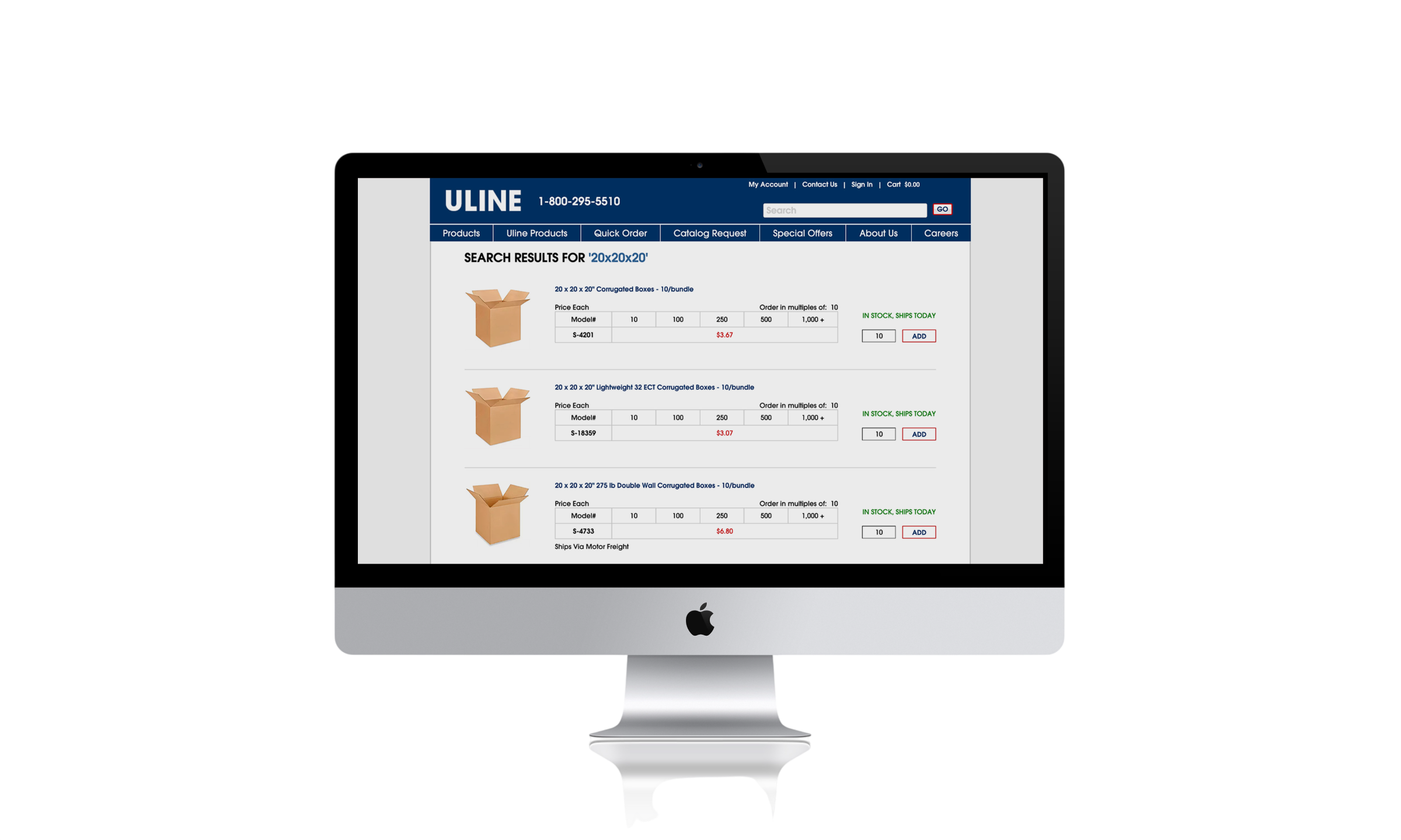
Ordering products wasn't as intuitive as it should be.
On a high-traffic B2B search results page, two usability issues were limiting conversion:
- It wasn't clear to users that items could be added to cart directly from the search results view
- Pricing/quantity-break information was difficult to parse
Research & Insights
Through stakeholder interviews, behavioral analytics, and session reviews, several recurring usability issues became apparent.
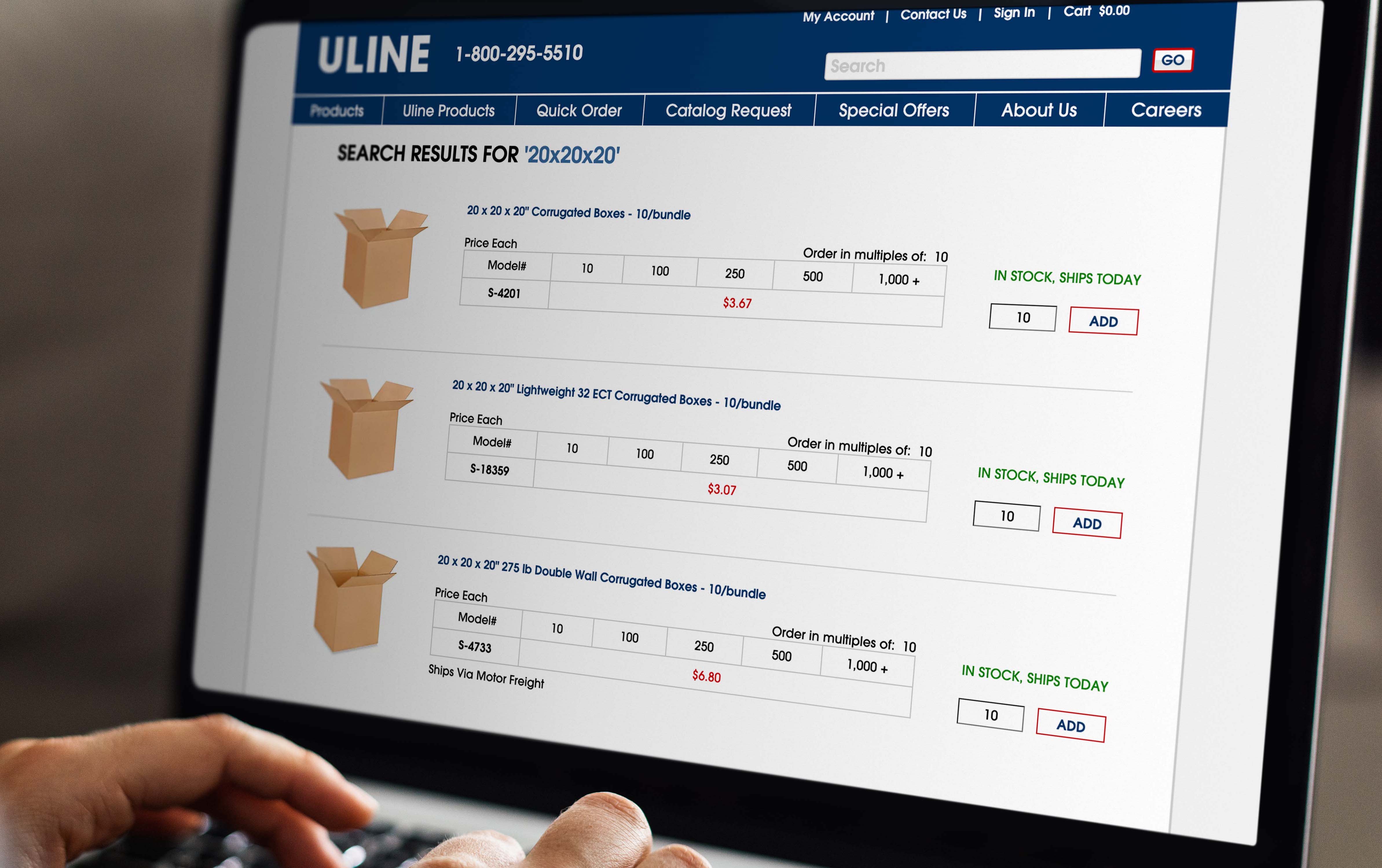
Exploring possible directions
Rather than jumping into a single solution, I generated multiple concepts that varied in complexity and risk.
- A gradual, low-risk improvement to the existing design
- A concept introducing new pricing functionality
- A concept centered on a redesigned primary CTA
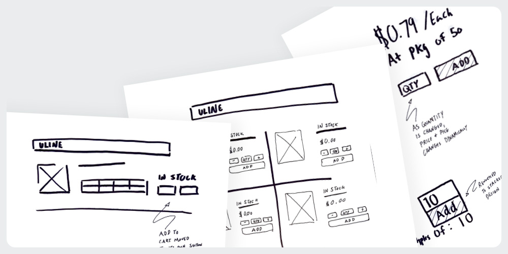
Prototyping and alignment
Interactive prototypes were built and presented to stakeholders to evaluate feasibility, business impact, and implementation effort.
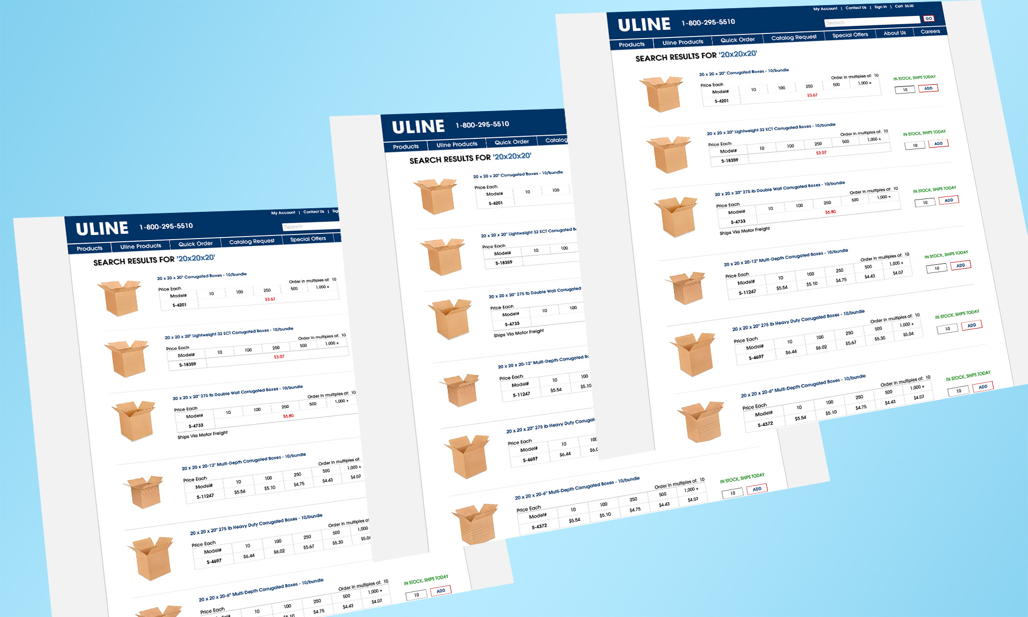
A streamlined ordering experience
Stakeholders selected a lower-risk solution focused on reducing friction while preserving familiar user patterns.
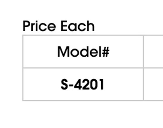
Clearer Readability
Improved information hierarchy and wayfinding.
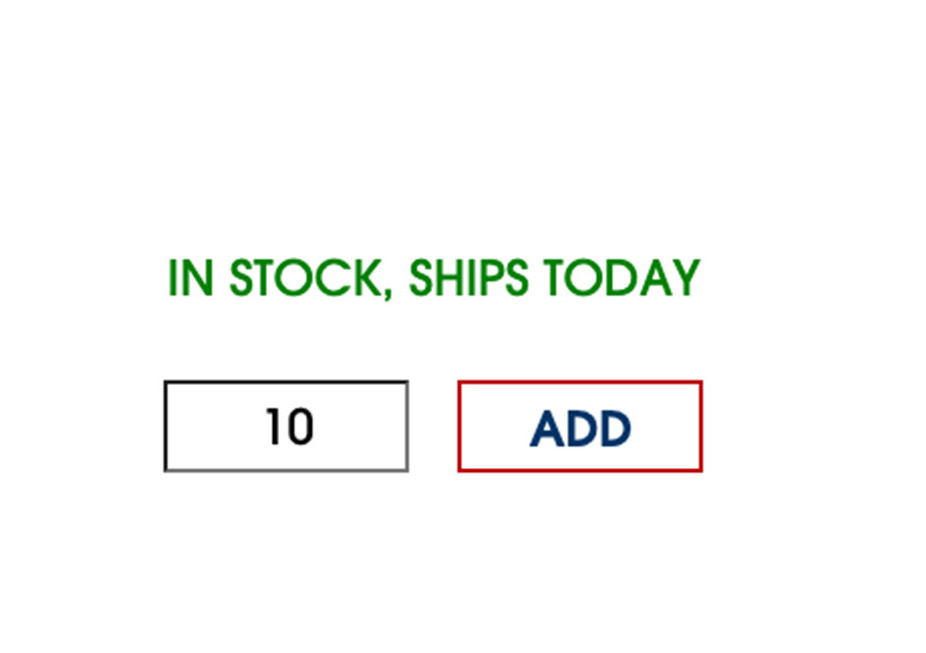
Simplified Add to Cart
Reduced complexity and improved task completion.
Results
The chosen concept led to a measurable improvement in both add-to-cart rate and order conversion following launch.
-
Increased Conversion
-
Increased Task Success
-
Increased User Satisfaction
Key takeaways
This project sharpened my ability to generate a range of concepts, collaborate cross-functionally, and present directly to stakeholders. Along with that, above all, reinforced that gradual, low-risk usability improvements can have huge impact, sometimes more defensibly than a bold redesign.
- Cross-functional collaboration
- Stakeholder communication
- Evidence-based design decisions
- Iterative problem solving